Pink Gellac V.I.P 2 Collection Swatches

Today I have a sprint collection from Pink Gellac to show on the blog. The V.I.P. 2 Collection came out in March, but if you are looking for a new pink shade, this collection might have exactly what you are looking for as it's all about the pinks.

I was sent this collection as a press sample. The opinions I express are my own, always.

First up is 339, Ballerina Pink. I am wearing three coats of this jelly polish. The shade is very discreet with a pink that doesn't lean warm nor cold and very discreet shimmer. You need to really look for it to see it! A classic "my nails but better" shade in my opinion, but nothing for those who can't stand visible nail line.

Pink Gellac V.I.P 2 Collection - 339 Ballerina Pink

Pink Gellac V.I.P 2 Collection - 339 Ballerina Pink

Pink Gellac V.I.P 2 Collection - 339 Ballerina Pink

Pink Gellac V.I.P 2 Collection - 339 Ballerina Pink

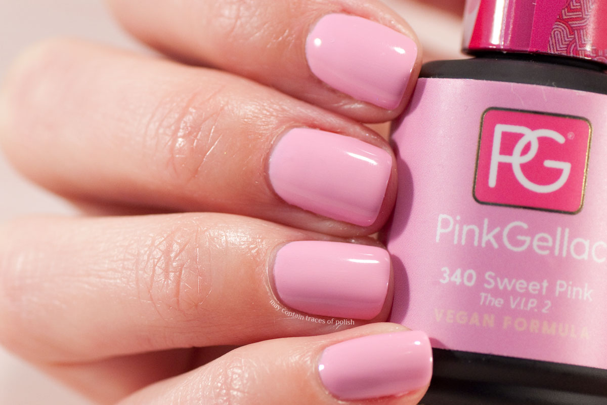
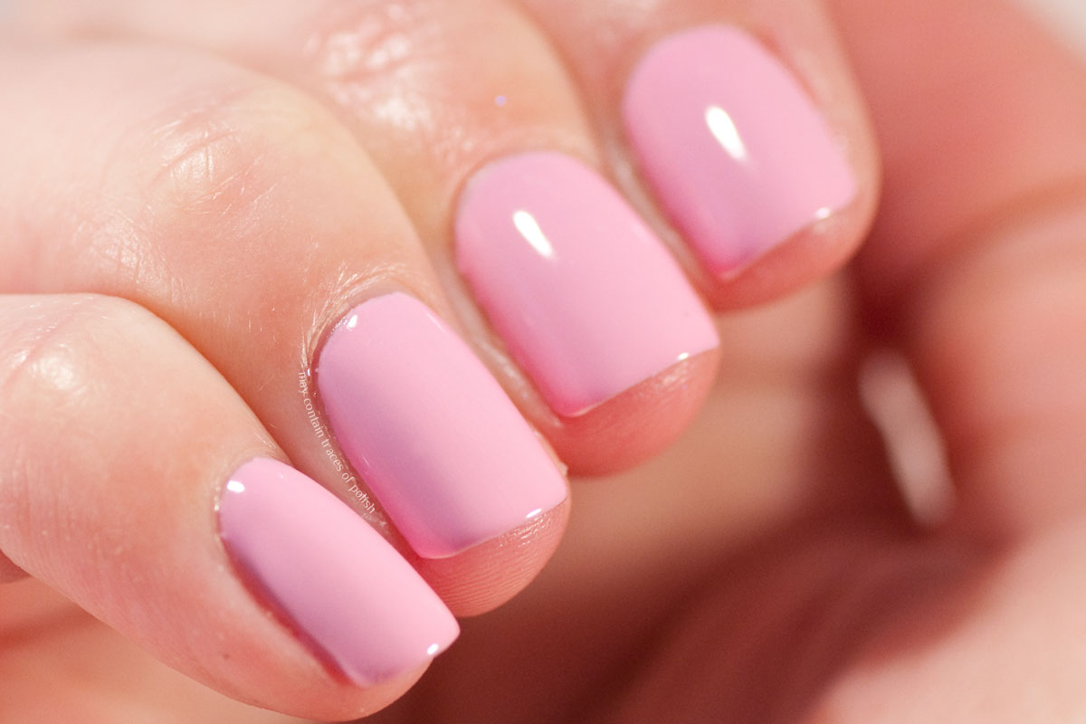
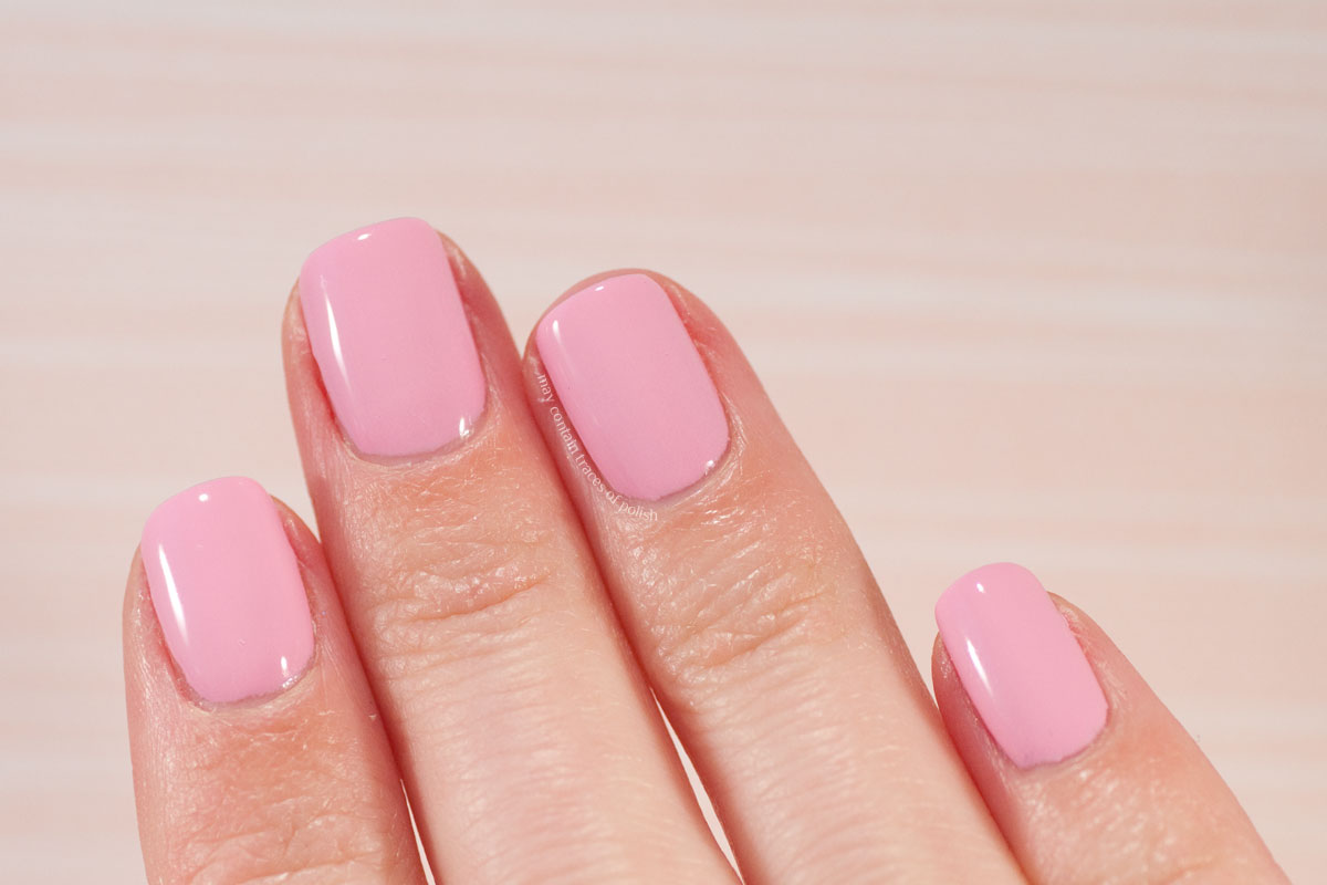
Next up is 340 Sweet Pink, a classic Barbie pink with clear cold undertones (they are more pronounced in my picture than in real life though). Covers nicely in two coats.
Pink Gellac V.I.P 2 Collection - 340 Sweet Pink

Pink Gellac V.I.P 2 Collection - 340 Sweet Pink

Pink Gellac V.I.P 2 Collection - 340 Sweet Pink

Pink Gellac V.I.P 2 Collection - 340 Sweet Pink

Number 341, Watermelon Pink is very aptly named, the shades definitely reminds me of watermelons! The shade strikes that perfect balance between red and pink in my opinion, and if you're like me and looking for a good coral shade, this is a very good option. Two coats. The picture photographs a bit too pink, do check out other swatches if considering this one.
Pink Gellac V.I.P 2 Collection - 341 Watermelon Pink

Pink Gellac V.I.P 2 Collection - 341 Watermelon Pink

Pink Gellac V.I.P 2 Collection - 341 Watermelon Pink

Pink Gellac V.I.P 2 Collection - 341 Watermelon Pink

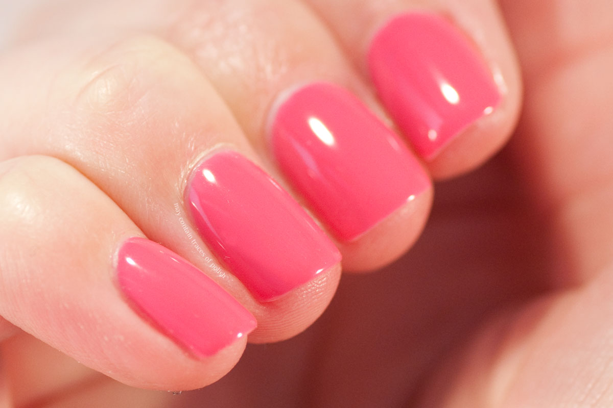
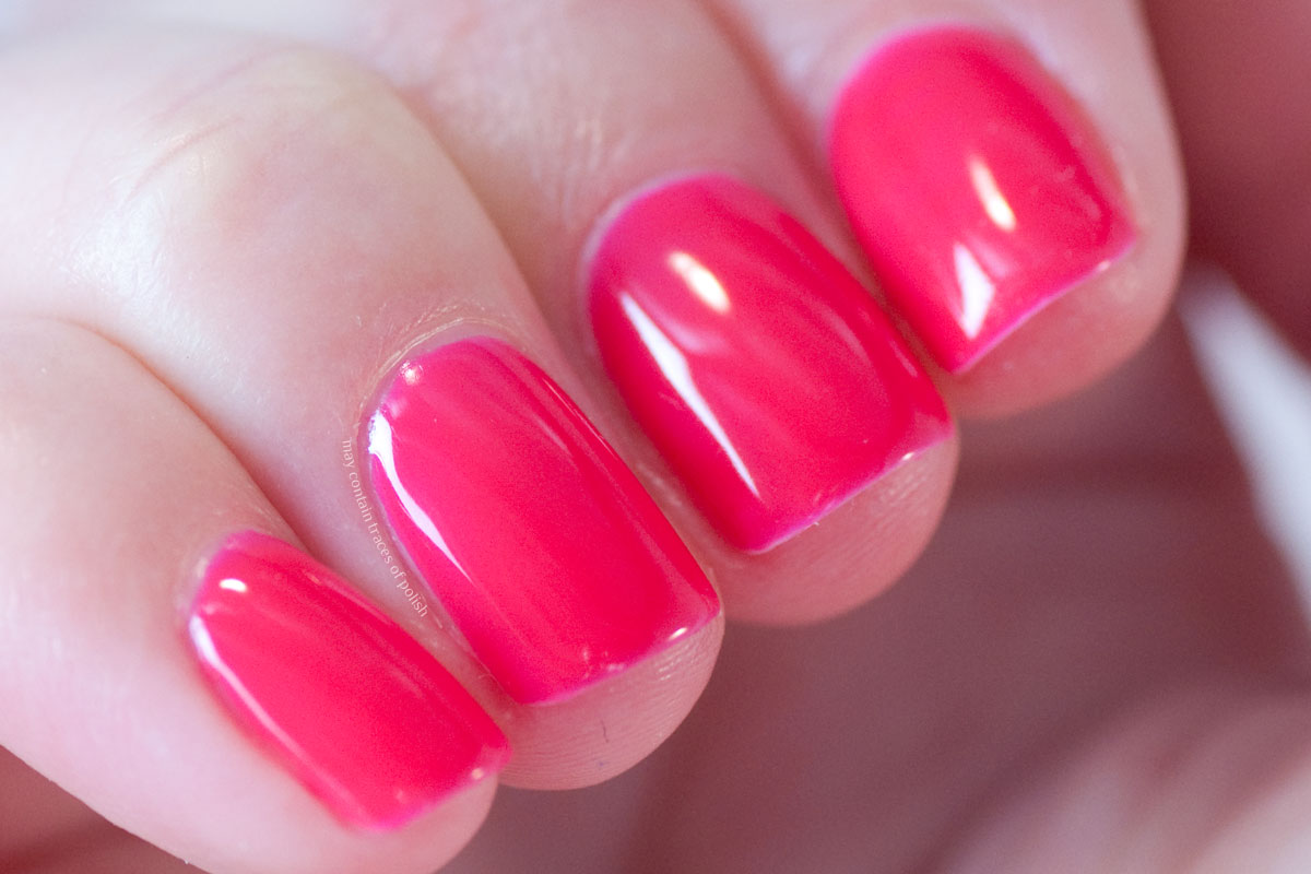
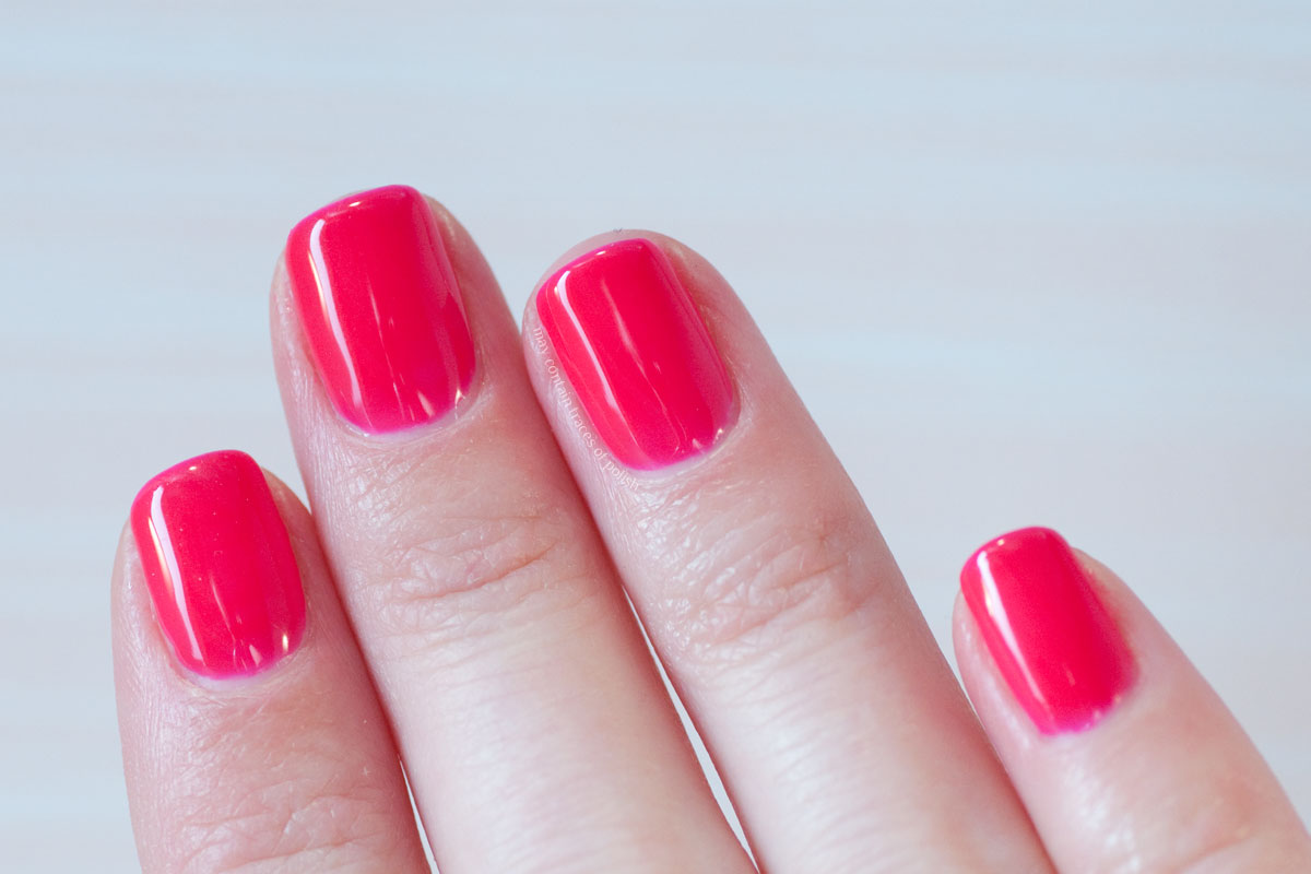
If you like your pinks a bit more fiery, look no further than 342, Ruby pink. This is the brighter cousin of Watermelon pink, as the shade of pink is quite similar, only this doesn't have any white mixed in and is more jelly like and very glossy. I'm wearing two coats.
Pink Gellac V.I.P 2 Collection - 342 Ruby Pink

Pink Gellac V.I.P 2 Collection - 342 Ruby Pink

Pink Gellac V.I.P 2 Collection - 342 Ruby Pink

Pink Gellac V.I.P 2 Collection - 342 Ruby Pink

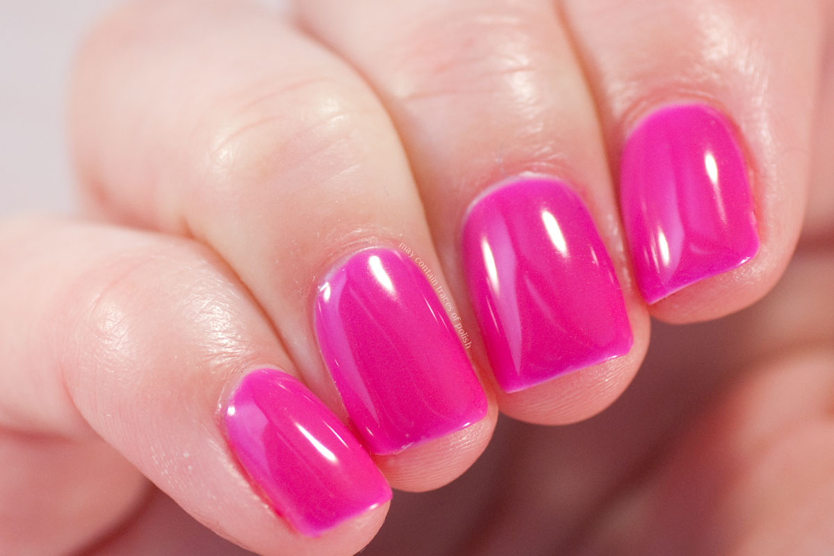
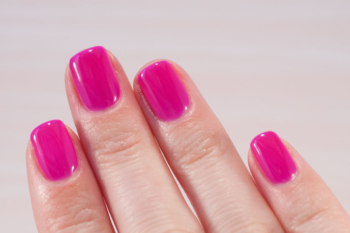
Finally we have 343 Sapphire Pink, which is like a colder purplish version of Ruby Pink. It also covers in two coats.
Pink Gellac V.I.P 2 Collection - 343 Sapphire Pink

Pink Gellac V.I.P 2 Collection - 343 Sapphire Pink

Pink Gellac V.I.P 2 Collection - 343 Sapphire Pink

Pink Gellac V.I.P 2 Collection - 343 Sapphire Pink

PÃ¥ svenska:
Idag har jag en vårkollektion från Pink Gellac att visa upp. V.I.P. 2 kom ut i mars i år har jag för mig, och om du letar efter den där perfekta rosa så kanske det här är helt rätt kollektion för dig. Det är nämligen bara rosa lack i denna!

Jag fick lacken som pressprover. Alla åsikter i texten är mina egna, alltid.

Watercolour Floral Nails

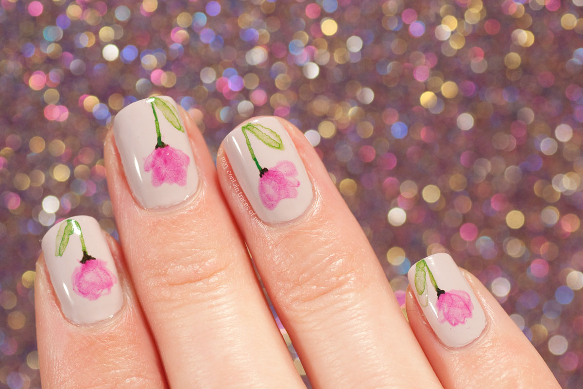
My Instagram feed is flooded with Halloween nails. I usually don't follow the seasonal trends as vigorously so here are some October appropriate florals!

Watercolour Floral Nails
I paint this style of nail art by using watered down acrylic paints. I paint leaves and other floral elements and let the paint half-dry before removing the excessive water/paint combination with a dry brush. The result is a sheer look, with bolder edges. This time I managed to get a slight crackled effect when adding top coat, that was not intentional, but it does look quite cool!

My base is OPI Steady as she Rose.
Watercolour Floral Nails

Watercolour Floral Nails

Watercolour Floral Nails

PÃ¥ svenska:
Min Instagram svämmar över av Halloween-naglar. Jag håller mig inte helt till trenderna så här kommer lite små blommor, för visst passar väl det fint så här i oktober?

Jag målar den här typen av design med akrylfärg som jag tunnat ut med vatten. Först målar jag ett eller flera små blad, sen väntar jag tills färgen börjat torka, och därefter tar jag en torr pensel och suger upp överflöd av färg/vatten. Resultatet blir att konturerna på designen blir mer synliga än själva mitten, vilket jag tycker blir mycket snyggt. Den här gången blev hela designen också lite krackelerad när jag applicerade överlack, men det var ett rent misstag. Men kan väl se det som att jag är ute efter en liten vintage-stil?

Min bas är OPI Steady as she Rose.